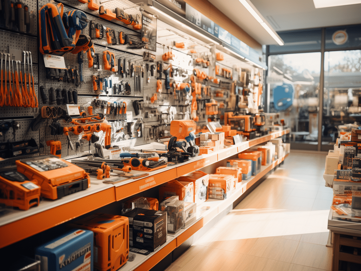
The major DIY brands, emblematic of the world of home improvement and renovation, have seen their symbols transform over the decades. These changes reflect not only the evolution of graphic design but also brand strategies and the shifting expectations of consumers. From simple logos to sophisticated emblems, these symbols tell a fascinating story of marketing, visual identity, and corporate culture. Their changes often mirror broader trends in commerce and society, demonstrating how brands adapt to an ever-changing business environment.
The evolution of symbols of major DIY brands
At the heart of commercial aesthetics, the symbols of DIY brands in France and Europe have undergone a metamorphosis that goes beyond mere graphic design. Take the case of Bricorama, a brand specializing in home improvement and decoration, which joined the Groupement Les Mousquetaires in January 2018. This strategic move was accompanied by a renewal of its visual identity, signifying the brand’s integration into a larger ensemble while maintaining its expert positioning in its field.
The Leroy Merlin logo, representative of the Adeo Group, illustrates another facet of this evolution. Its emblem, recognized across Europe, symbolizes the quality and diversity of services offered by the brand. Each logo change at Leroy Merlin has aimed to reflect a quest for innovation and closeness to its customers, thereby reinforcing the brand’s identity and commitment to sustainability and responsibility.
Moreover, other major players such as Castorama, owned by Kingfisher, and Les Briconautes, belonging to the Mr Bricolage Group, have revised their image to align with new marketing standards and meet the expectations of an increasingly savvy audience. These brands have managed to navigate between tradition and modernity, between local roots and international expansion, demonstrating through their graphic evolution their ability to adapt to contemporary challenges in the sector.

The current and future challenges of visual identity in the DIY sector
In a sector where competition is intensifying, visual identity becomes a strategic vector for differentiation. DIY brands, aware that aesthetics is a powerful communication lever, are doubling their efforts to forge a strong and recognizable brand image. The Groupement Les Mousquetaires, with its various brands including Bricomarché, Brico Cash, and Bricorama, embodies this dynamic by harmonizing its brands while preserving their uniqueness.
Design, far from being a mere artist’s affair, transforms into a science serving the consumer experience. Castorama and Kingfisher, for example, invest not only in quality materials but also in a visual style that reflects this demand. The stakes are high: it is about appealing to an increasingly discerning and demanding target audience, attentive to the details that embody the brand.
Furthermore, the online presence of brands becomes fundamental. Brico Leclerc or L’Entrepôt du Bricolage of SAMSE, to name a few, have no choice but to adopt visual identities suited to the digital world, where speed of recognition and visual impact are among the key factors for success. Collaborations with artistic talents to create unique designs are multiplying, illustrating the growing importance of originality in content creation for blogs and customer-focused sections.
The future of visual identity in the DIY sector is set to be marked by technology. Companies like Brico Pro, affiliated with the Cofaq Group, are paving the way for the use of augmented and virtual realities to offer an immersive and personalized experience. The first step on this journey towards innovation is already underway, with brands like Leroy Merlin of the Adeo Group exploring these new frontiers at the intersection of marketing, art, and technology.